
Introduction – Why Color Matters More Than You Think
When you walk into a room, you feel something—even if you can’t quite put your finger on it. Perhaps it’s the warmth of terracotta walls that makes you want to linger, or the crisp white of a minimalist space that helps you breathe easier. This isn’t coincidence; it’s the profound connection between interior design and mental well-being at work.
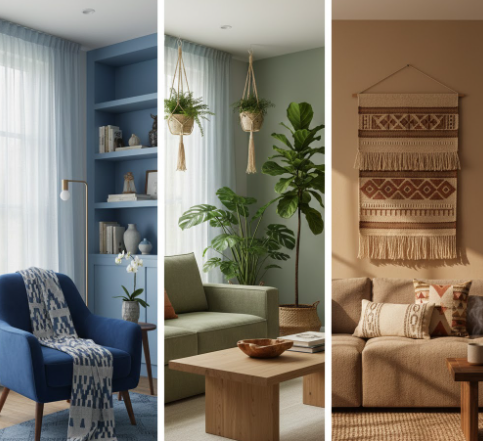
Colors don’t just decorate our spaces—they influence our mood, behavior, and emotions in ways we’re only beginning to fully understand. A shade of blue might lower your heart rate and ease anxiety, while a vibrant yellow could energize your morning routine or, if overused, leave you feeling overstimulated by afternoon. This is why professional interior designers don’t simply choose colors based on current trends or personal preference. They consider the psychological impact of every hue, understanding that the colors surrounding us shape how we feel, think, and live each day.
The Psychology of Color in Interior Design
How the Brain Responds to Color
Our brains are remarkably attuned to color. When light enters our eyes, it triggers neurological responses that extend far beyond simple visual processing. Different wavelengths activate specific emotional and physiological reactions—some colors can literally change your heart rate, affect hormone production, or alter your perception of temperature in a room.
Warm colors like red, orange, and yellow tend to stimulate and energize. They’re associated with action, passion, and alertness. Cool colors such as blue, green, and purple generally have a calming effect, promoting relaxation and introspection. This warm-versus-cool distinction forms the foundation of color psychology in interior design, but the story doesn’t end there. The intensity, saturation, and combination of colors all play crucial roles in how a space affects your mental state.
Color, Light, and Space Perception
Color never exists in isolation—it’s constantly interacting with light. Natural sunlight reveals the truest version of a color, while artificial lighting can dramatically shift how we perceive it. A serene sage green in daylight might appear dull and grayish under warm incandescent bulbs, completely changing the emotional atmosphere of a room.
Beyond mood, colors manipulate our perception of space itself. Light colors reflect more light, making rooms feel larger and airier—perfect for small apartments or spaces where you want to encourage openness and mental clarity. Darker colors absorb light, creating intimate, cozy environments that can feel protective and grounding, though they may also feel confining if used without intention.
How Different Colors Affect Mental Health
Blue – Calm, Focus, and Stress Reduction
Blue stands as one of the most psychologically beneficial colors for mental health. Studies have shown that blue environments can actually lower blood pressure and reduce anxiety levels. This makes blue ideal for bedrooms where quality sleep is essential, home offices where concentration matters, and meditation spaces designed for mental stillness.
The key is choosing the right shade. Soft, muted blues create tranquility without feeling cold, while deeper navy tones add sophistication and security. However, be cautious with very pale or grayish blues in rooms with limited natural light—they can sometimes feel melancholic rather than calming.
Green – Balance, Healing, and Emotional Stability
Green connects us to nature, tapping into our innate need for natural environments—a principle known as biophilic design. This connection makes green remarkably effective for emotional balance and stress reduction. It sits perfectly balanced between warm and cool on the color spectrum, which may explain why it feels so harmonizing to our psychology.
Living rooms benefit enormously from green tones, creating spaces that feel both refreshing and grounding. Wellness areas, bathrooms, and reading nooks also thrive with green palettes. From soft sage to rich emerald, green’s versatility allows it to adapt to various design styles while consistently supporting mental well-being.
Yellow – Energy, Happiness, and Optimism
Yellow captures the warmth of sunlight, making it a powerful mood booster. It stimulates mental activity and can generate feelings of happiness and optimism. This makes yellow wonderful for kitchens, where you want morning energy, and creative workspaces where innovation thrives.
However, yellow requires careful handling. Bright, saturated yellows in large doses can overstimulate, potentially leading to anxiety or irritability. The solution lies in choosing softer, buttery yellows or using brighter shades as accents rather than wall colors. Balance is everything when working with this energetic hue.
Red – Passion, Energy, and Alertness
Red is perhaps the most physiologically stimulating color. It can increase heart rate, raise blood pressure, and heighten awareness—effects that make it powerful but potentially problematic. Red demands attention and generates intensity, which is why interior designers typically use it strategically rather than liberally.
Small doses of red can energize a dining room or add passion to accent walls, but entire rooms painted in strong reds may create mental fatigue over time. If you’re drawn to red, consider deeper burgundies or terracotta tones that provide warmth without overwhelming stimulation.
Neutral Colors – Safety, Comfort, and Mental Clarity
White, beige, gray, and earth tones create psychological safety. They provide visual rest, allowing the mind to settle without constant stimulation. Neutrals have become increasingly popular in Filipino homes, partly because they offer adaptability but also because they support mental clarity in our overstimulated world.
The challenge with neutrals is avoiding spaces that feel cold or institutional. Layer different neutral tones, incorporate varied textures, and add warmth through natural materials like wood and woven fabrics. This approach creates calm without sterility.
Choosing the Right Colors for Each Room
Bedroom Colors for Better Sleep and Relaxation
Your bedroom should be a sanctuary for rest. Cool, muted tones like soft blues, gentle greens, and warm grays promote the relaxation necessary for quality sleep. These colors help lower cortisol levels and prepare your mind for rest.
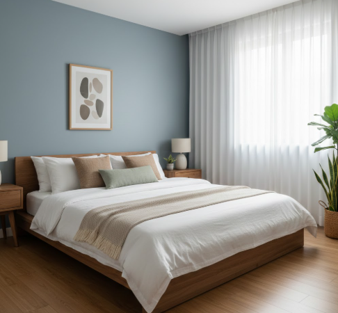
Avoid energizing colors like bright reds, oranges, or intense yellows in sleeping areas. Even if you love these colors, save them for spaces where alertness serves you better.
Living Room Colors for Connection and Comfort
Living rooms serve as gathering spaces, so they should feel welcoming without causing restlessness. Warm neutrals like taupe and greige create inviting atmospheres, while soft greens and muted blues add freshness. The goal is creating an environment where family and guests feel comfortable enough to relax but engaged enough to connect.
Home Office Colors for Focus and Productivity
With more Filipinos working from home, office color selection has become crucial for mental health. Blues and greens improve concentration and reduce mental fatigue during long work sessions. Avoid colors that are either too stimulating (which causes burnout) or too calming (which reduces productivity).
Kitchen and Dining Area Colors for Appetite and Energy
Warm colors naturally stimulate appetite, which is why restaurants often use reds, oranges, and warm yellows. However, for home kitchens, balance energizing tones with enough calm to make meal preparation enjoyable rather than frenetic.
Cultural and Lifestyle Considerations in Color Selection
Cultural Meaning of Colors in Filipino Homes
In Filipino culture, colors carry specific meanings that influence how we emotionally respond to them. Red symbolizes good fortune and celebration, white represents purity and peace, while yellow connects to royalty and prosperity. Understanding these cultural associations helps interior designers create spaces that resonate emotionally with Filipino homeowners.
Modern Filipino homes often blend traditional color meanings with contemporary design, creating spaces that honor cultural identity while supporting mental wellness.
Personal Preferences and Emotional Triggers
Color psychology provides guidelines, not rules. A color that calms one person might trigger stress in another based on personal history and associations. This is why personalization matters so much in interior design. At VRSO Interiors, we always consider individual experiences alongside general color theory when designing wellness-focused spaces.
Common Color Mistakes That Can Affect Mental Health
Many homeowners unknowingly create spaces that work against their mental well-being. Overusing dark colors in small spaces can create feelings of confinement and depression. Pairing poor lighting with cool colors often results in environments that feel unwelcoming or even depressing.
Another common mistake is following trends without considering emotional impact. That trendy all-black bathroom might look stunning on social media, but could it increase your stress levels during your daily routine? Always prioritize how a space makes you feel over how it photographs.
How Interior Designers Use Color to Support Mental Wellness
Color Zoning for Emotional Balance
Professional designers often use color zoning—assigning different colors to different functional areas within a space. This technique helps create psychological boundaries, signaling to your brain when it’s time to focus, relax, or energize.
Combining Color with Texture and Materials
Color never works alone. Pairing soft blues with natural wood creates very different feelings than the same blue with sleek metal finishes. Textures, materials, and finishes all contribute to the emotional atmosphere, which is why professional designers consider the complete sensory experience.
Tips for Creating a Mentally Healthy Home Through Color
Start with a neutral base that provides flexibility and calm. This foundation allows you to add personality through accent colors without overwhelming your senses. Always test colors before fully committing—paint large swatches on different walls and observe them throughout the day as light changes.

Balance is crucial. If you love bold colors, use them intentionally in spaces where their energy serves a purpose, then balance them with calming tones in areas dedicated to rest and recovery.
When to Consult an Interior Designer
While these guidelines help, creating truly wellness-focused interiors requires expertise in balancing psychology, aesthetics, and functionality. Professional interior designers understand how to navigate the complex interplay between color, light, space, and individual needs.
At VRSO Interiors, we approach every project by considering not just how spaces look, but how they make people feel. We create color palettes that support your daily rhythms, enhance your mental clarity, and promote genuine well-being.
Frequently Asked Questions
Q1: What is the best color for a bedroom to improve sleep quality?
A: Soft, cool colors like muted blues, gentle greens, and warm grays are ideal for bedrooms. Blue, in particular, has been shown to lower blood pressure and reduce anxiety, making it excellent for promoting restful sleep. Avoid energizing colors like bright reds, oranges, or intense yellows in sleeping areas, as these can stimulate rather than relax the mind. The key is choosing colors with low saturation and cooler undertones that help your body naturally wind down at the end of the day.
Q2: Can the wrong room colors actually cause stress or anxiety?
A: Yes, certain colors and color combinations can negatively impact mental health. Overusing highly saturated or intense colors—especially reds and bright yellows—can overstimulate the nervous system, potentially leading to increased stress, irritability, or anxiety. Additionally, very dark colors in small spaces with poor lighting can create feelings of confinement or depression. This is why professional interior designers carefully balance bold colors with calming tones and consider how lighting affects color perception throughout the day.
Q3: How do I choose colors if different family members have different preferences?
A: The best approach is to use neutral base colors in shared spaces like living rooms and hallways, then personalize individual rooms according to each person’s preferences and needs. You can also use color zoning within open-plan spaces to create different emotional atmospheres for various activities. Consider cultural and personal associations with colors—what relaxes one person might energize another based on their experiences. Working with an interior designer can help balance everyone’s needs while maintaining a cohesive look throughout your home.
Q4: Do I need to repaint my entire house if my current colors aren’t supporting my mental health?
A: Not necessarily. You can start with the rooms where you spend the most time or where mental wellness is most critical—typically bedrooms and home offices. Sometimes simply changing accent colors through textiles, artwork, or accessories can shift a room’s emotional impact without major renovation. Testing new colors with large paint swatches before committing helps you understand how they’ll affect your daily mood. Strategic changes in key areas often provide significant mental health benefits without requiring a complete home makeover.
Q5: How long does it take to notice the mental health effects of changing room colors?
A: Some effects are immediate—you might feel more relaxed or energized as soon as you enter a newly painted room. However, the deeper impact on sleep quality, stress levels, and overall mental well-being typically becomes noticeable within 2-4 weeks as your brain adjusts to the new environment. This adjustment period is why it’s important to live with color samples for several days before making final decisions. Pay attention to how you feel in the space at different times of day and during various activities to ensure the colors truly support your mental wellness goals.
Conclusion – Designing Spaces That Support Mental Well-Being
The colors surrounding you aren’t merely decorative—they’re active participants in your mental health. Every shade you choose either supports or challenges your emotional well-being, influences your productivity, affects your sleep quality, and shapes how you experience your home.
Designing with intention means looking beyond aesthetics to consider the psychological impact of every color decision. It means understanding that the peaceful bedroom that helps you sleep, the focused home office that boosts productivity, and the welcoming living room that brings family together all rely on thoughtful color selection grounded in psychology.
Your home should be more than beautiful—it should be a place where your mental health thrives. By understanding how colors affect your mind and emotions, you can create spaces that truly support the life you want to live.
